• Before Search
Problems here are:
1. The outdated style of search bar causes poor usability
2. User can hardly find relation between suggestion items
Show ''Recent and Popular search terms'' and support user with ''Autocomplete''
The new design has clear visual clues (like clean button) and good interaction.
• After Search
Problems here are:
1. poor visual and information hierarchy
2. poor usability when having abundant results
• Grid (Tab) or list view ( No tab, filter instead) ?
Though the current design had a grid view, I had tried another design pattern of a list view. However, we decided to keep the grid view because of one reason.
Compared with other platforms like learning platform, users on OTT are usually searching for some eye-catching things. So the design should put more emphasis on the thumbnail rather than others.
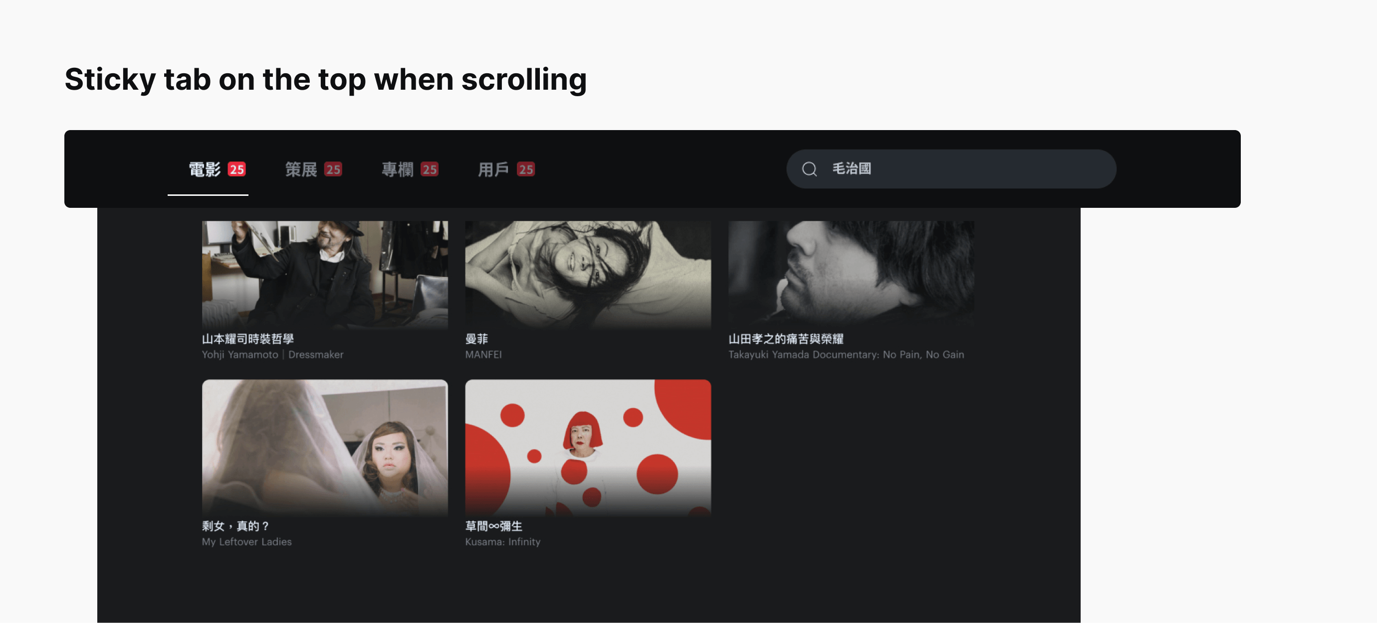
• Scroll or pagenation ?
Do we keep the existing infinite scroll or have paginations?
To make the experience more immersive, I decided to keep the infinite scroll. However, users might get lost in abundant results, so I make the tab fix on top to help users.


.gif)